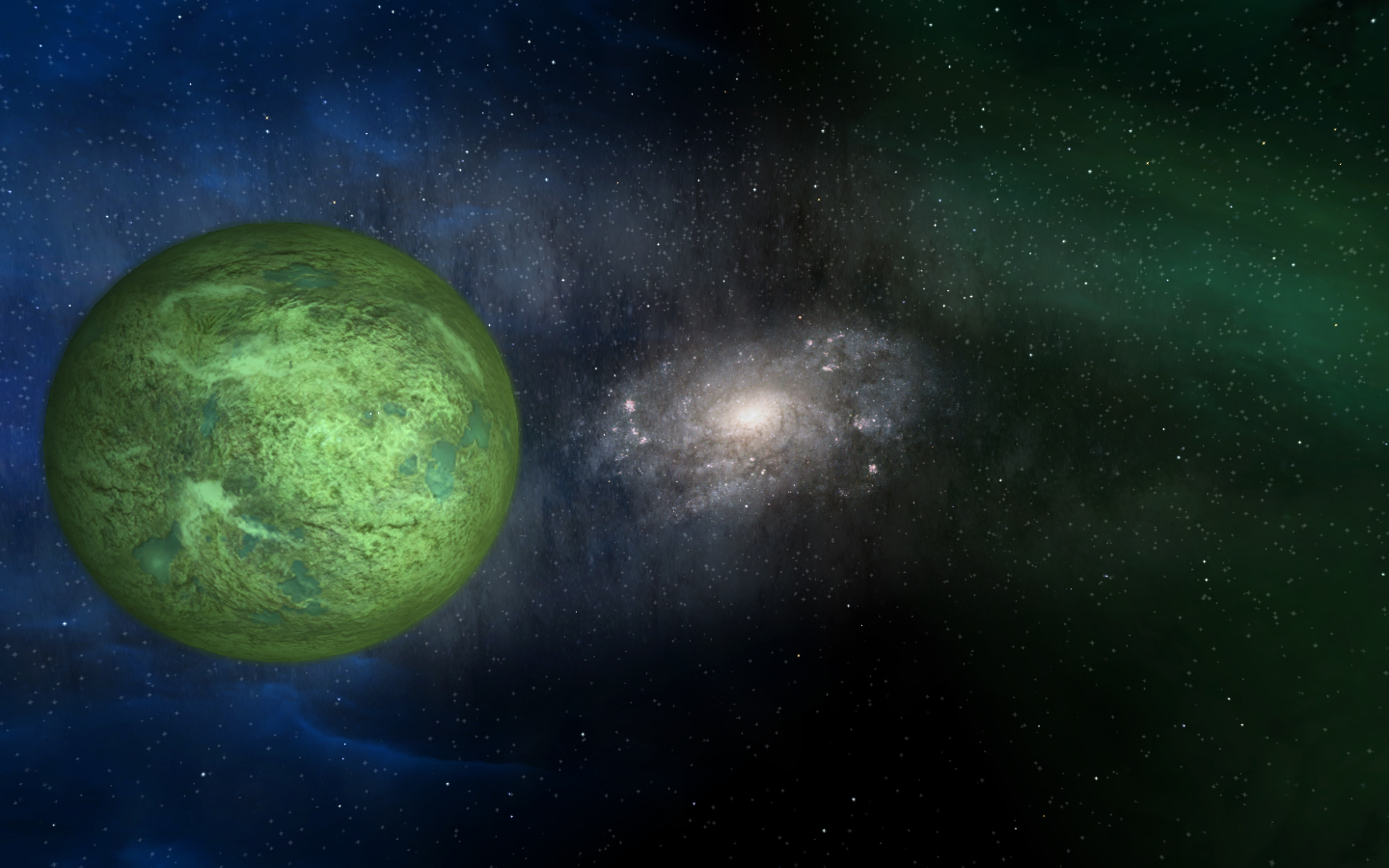
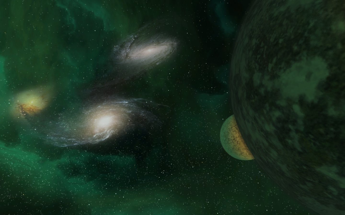
What do you think?
-
Hunor wrote:
Almost finished, A couple of days will be available to everyone.youza awesome
and thank u very much -
Hunor wrote:
I’m not so talented. Just downloaded some pictures from the Internet and i cut them up with photoshop. I tried to get more similar to the original nebulas. That’s all…No, any one who can make the beautiful nebulaes are talented.

It’s really beauty anyway, and makes me realize only the nature things is beauty things (For this case at least).
Maybe i will upgrade my starspheres for Sirius Sector when i’m free.
-
Absolutely outstanding work!!
Good luck with the rest.
Rik
-
i think we can call it “photo-realism-starsphere-mod”

-
Since this is totally clientside - how about packing both your atmospheres and the FL HD texture mod into one package?
-
Bas wrote:
Since this is totally clientside - how about packing both your atmospheres and the FL HD texture mod into one package?Possible, but I plan to do my own textures for the planets…
-
They do look fantastic! But i note you don’t show any of the nebulas in your screenshots. I tried going down a similar route to yourself but the nebulas looked bloody awful cos they just don’t blend in with that sort of background. Ended up using very similar textures to the originals, you can see bits of them in my Xlancer pics in the gallery.
Yours will be bloody awesome if you don’t use any nebulas though, or you can make better textures for the nebulas to compliment them. I tried but failed, looked like big square blocks in space for some reason, maybe alpha or something I guess.
Top work anyway!
-
Well, you could think over using the HD textures as a base to start your texture work with. Just a rand() idea, I am not going to dictate you how and what you should do and what not.
-
Hidamari wrote:
omg sex for my eyes.
@Hunor:
said that before, but thats looks impressive.
& u dont need to fusionate packs, cuz afaik the fl-hd pack and custom starspheres wont bite or override eachother.
so everyone can decide what he/she is using.anyway, im lookin forward to the release

-
@ Timmy, I think I’ll be able to produce nebulae that fit this. If they look like blocks, try lowering the brightness of the colour in the [Fog] section, that way they should blend in a little better.
Just incase anyone else doesn’t know what the hell I’m going on about, both [Fog] and [Exterior] are viewable from distance. [Exterior] is the core of the nebula and [Fog] is the surround.
For more info see here: http://the-starport.net/freelancer/forum/viewtopic.php?post_id=8260#forumpost8260
Hope this helps someone.
Oh and Hunor, I’m loving the latest productions!
Cheers,
Rik


