New Renderer (OpenGL 3.3)
-
Looks okay in that last video, fix those tanks and you’re in better shape there I think. Does look far better in video than screenshots so well done.
It would be easier to form a proper opinion if you didn’t have different coloured light sources, something that never really made any sense to me in freelancer if I’m honest, but each to their own as it’s purely an artistic choice. If it were made per system, gas cloud, or purely dynamic effects like gas jets, station lights, laser beams etc I’d get it, but it doesn’t work well for my eyes when adjacent surfaces of the same station are lit in sharply contrasting colours.
-
oil is a good way to prevent oxidation (not that there is much oxigen in space… im just trying to find a good explanation)
also keep in mind that metal can have very different looks depending on its composition
-
Schmackbolzen wrote:
…
I can make another video, but for that I would use the settings you prefer
…Can you record video with regular random mission at 1280x800 resolution?
-
I can, but I am not sure what you want to see there? You’ll get me flying wild behind some ships

Here is a video with a PBR based lighting model: Link
-
That’s made quite a nice difference, subtle but effective, well done.
-
I also think it is better, but maybe too weak. One of the next tasks is to calculate a better reflective base colour, so that the “oil effect” is reduced and you can tune the reflections up a little. I have had some results, but I am not there yet.
In the meantime I have implemented gamma correction and now the lighting calculations should correctly take place in linear space. I think it looks much better (you can see it everywhere in the game): Link
-
Yeah, that’s fixed the lighting, top job, your hard work is paying off in spades my friend!
-
Thanks! Here is a video with settings for the reflections Skotty and I like: Link
Probably still not optimal, but I will leave it by that for now, since I plan to leave the settings to the people who configure the materials (which hopefully will not be me ;)).
-
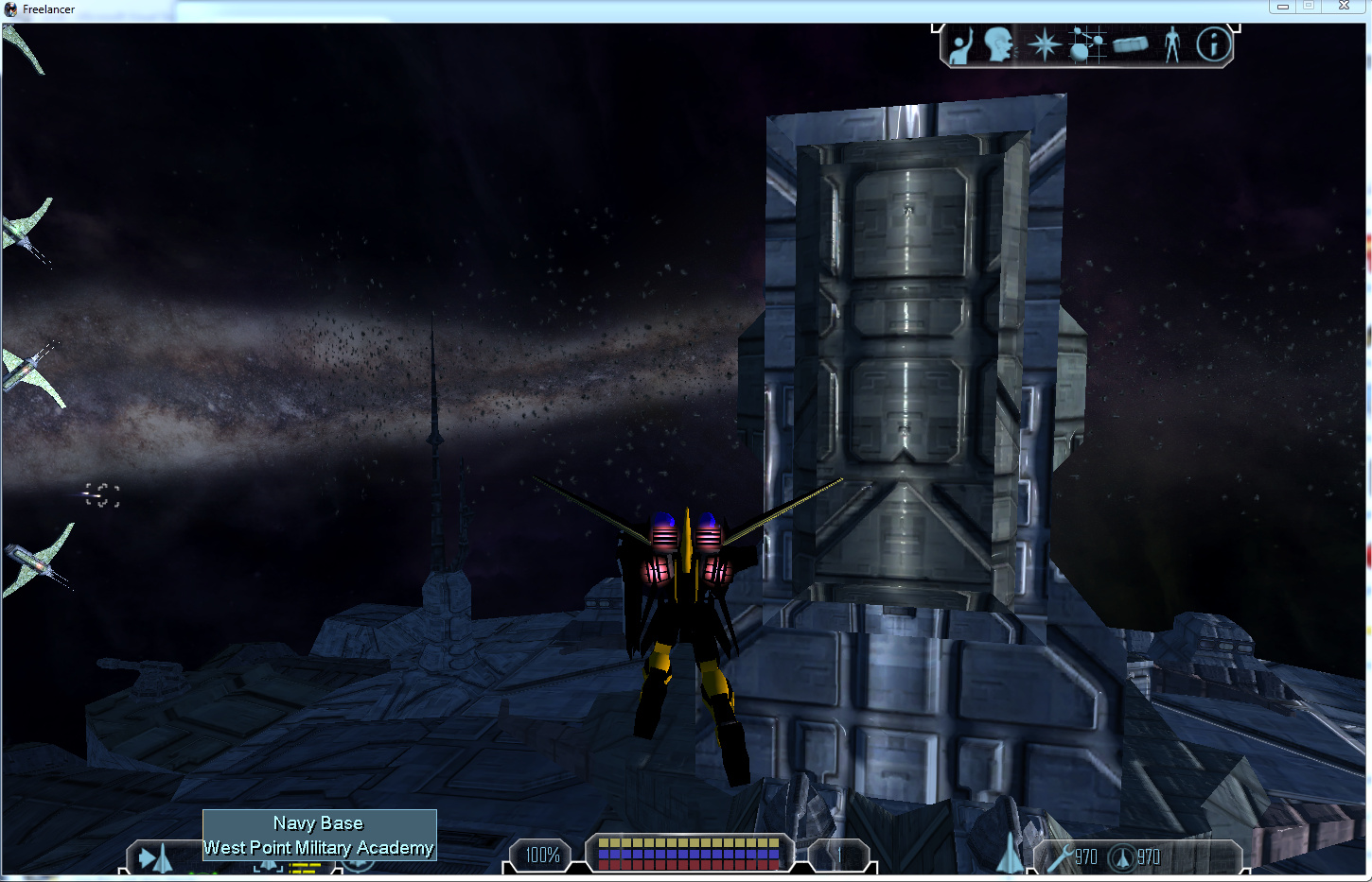
Yeah, that’s introduced some different lighting issues now hasn’t it, faces on the tanks are lit incorrectly with the bottom triangle of the face showing highlights and the top not, and large parts of the base showing highlights which should be in shadow at times. You’ve got your work cut out with this fella! Keep at it and you’ll crack it eventually I’m sure.
-
Those have been there all the time. The problem is with the tbn data in the models (I had written it in one of my last post somewhere :)) There is a reason I said development will still take time
 I need to port the algorithm to correctly generate them, because I only have c++ code for now, but the UTF editor is c#. I only added a quick fix to correct much worse lighting problems like this:
-
Schmackbolzen wrote:
I can, but I am not sure what you want to see there? You’ll get me flying wild behind some ships
…
I do not want to see - i want to feel and compare with vanilla

It is because when player going to complete missions - he is blind usually about game details. If he feels comfortable in this moment - then success
-
Not talking about that stripe, are we watching the same video? I’m sure you can see far better than I can in a video though.
-
It is the same cause, trust me
 Just wait until I fixed it and then you can nag if you see still see problems
-
@Helloween: Sry, forgot to answer

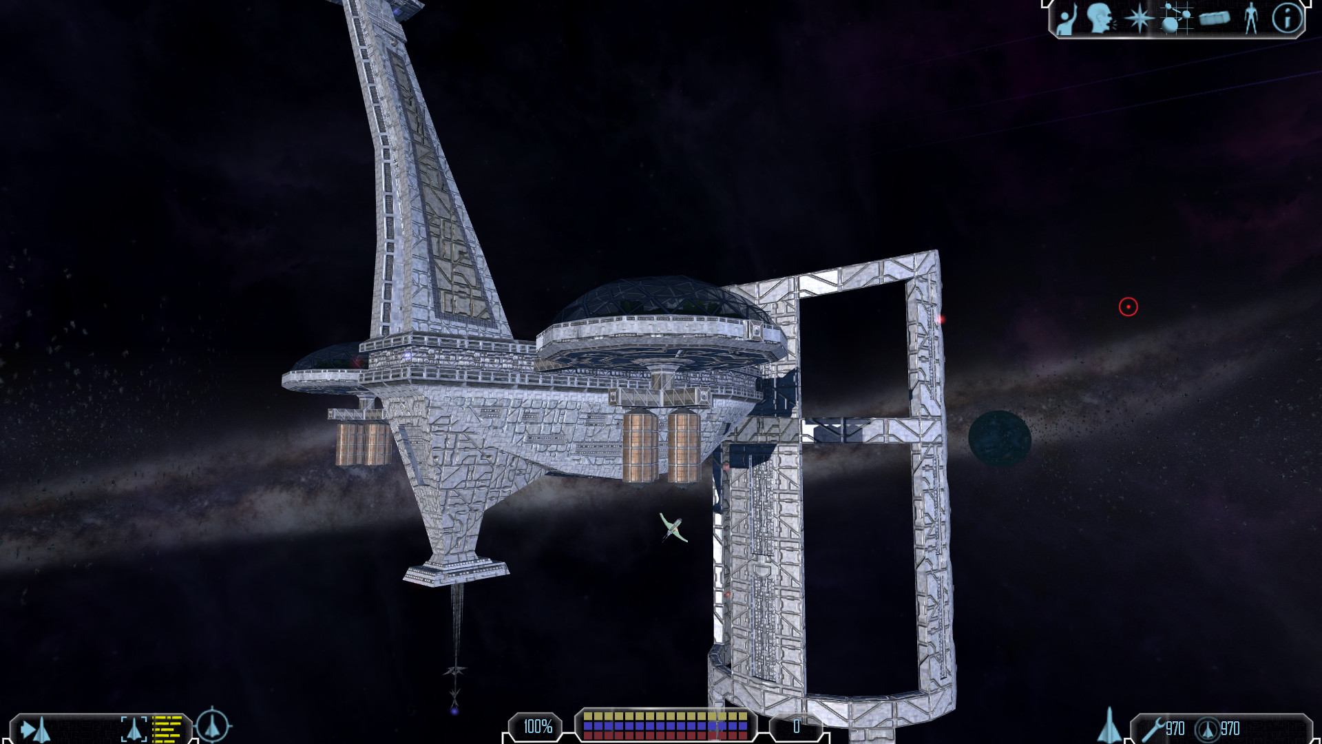
I can make a video when everything works and I think I have a more final version. I don’t know how much will still change. The game now looks again completely different than before a week ago and it is starting to look way better than I was expecting. But I can guarantee you, that the atmosphere has changed a lot. For example this is currently the station at planet Manhattan:

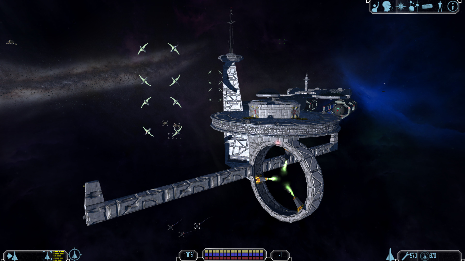
Fort Bush also looks quite nice:

-
Just had to step in to say that your work is awesome. Keep it up mate. I hope once you release the final version, other modders will work on it to improve it even further (if the renderer is capable of that, ofcourse). I wish you best of luck for your project. I hope we end up with graphics of FW:TOW but for vanilla. FF, wodk4, sizer and adoxa are helping you in it. That is how the FL community should be instead of modders having indifference and hostilities between them.
-
Thanks for the kind words!
I don’t think there are hostilities. FF helped me out with some offsets (e.g. shadows would not work otherwise) and all the .sur files of TOW should have been generated with my sur converter (if they did not change it).
My main issue is with the models and textures anyway. There are a few tough cases where the vanilla stuff did not age well. I hope there will be people who are willing to recreate the models and textures, but I am not too optimistic. At least mods can really improve their graphics, if they find the right models. I will probably write a new .cmp converter to make the conversion easier (no promises, but lots of code is already there).
-
Yeah, I was about to say, the biggest problem is that most of FL’s stuff aged poorly. The style was never great to begin with, but it doesn’t fare well when you try to upres it. You’d need to redesign it entirely with FL’s original style being more a spirit than anything else.
Also, you haven’t even broached planets yet, which are a completely different game. You can’t have modern looking models with FL’s crummy planets.
-
Not indifference between you and the FW:TOW team. I am talking about indifferences between other modders.
Anyway, I can help (I don’t know 3d modelling and texturing (though i am learning it, which is hard)). If there are is any misc work you can tell me and I am sure there isn’t a scarcity of talented people on the forums.
-
@FF: Yeah, for planets I have some ideas, but we will see whether it will work. It won’t be easy I guess.
@zebby: Sorry, then I misunderstood you. Also thanks for the offer. I think once I am far enough I might actually start asking for help and hope enough people respond. We will see

In the meantime for people who enjoy videos: Here is another one where I test exposure values for filmic tone mapping. I needed a GUI at this stage so now one also is included. Should come in handy I think. The tone mapping works surprisingly well for my taste (and others I have asked ;)). But I still need to apply it to the glow maps (windows etc) and effects, so they don’t use it yet.