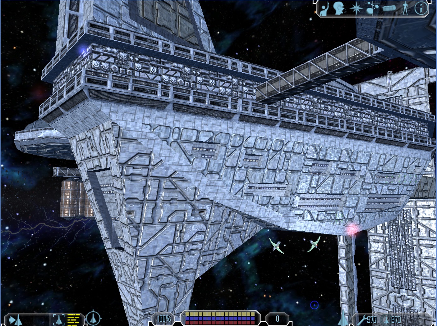
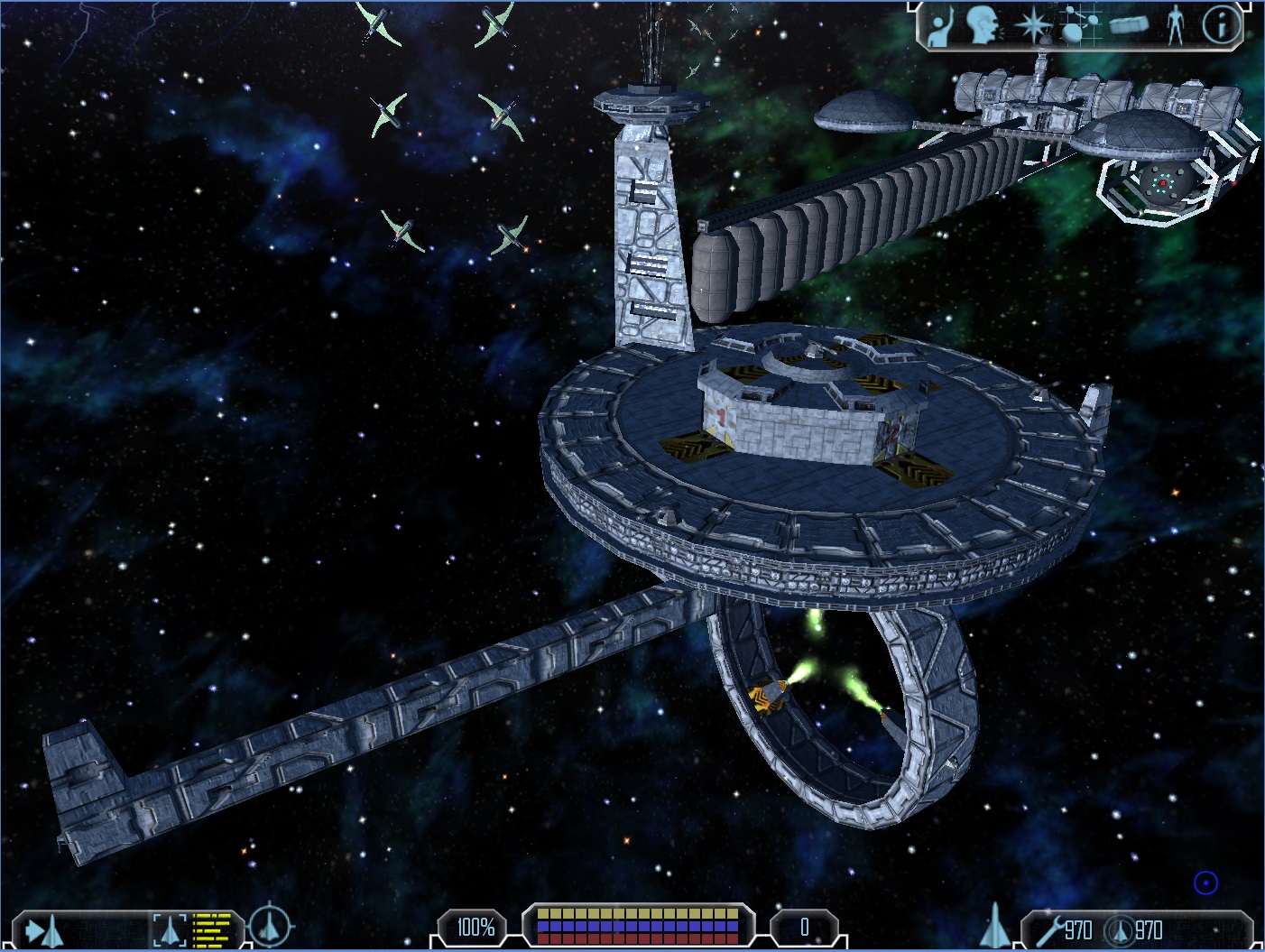
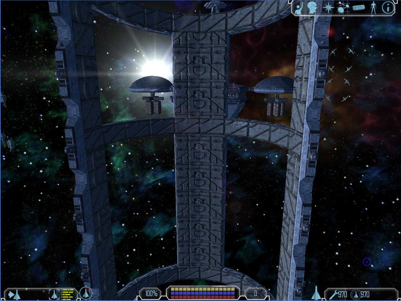
New Renderer (OpenGL 3.3)
-
Yeah, the base textures are not easy to work with, also the heightmaps are not ideal. I don’t have the time for proper textures

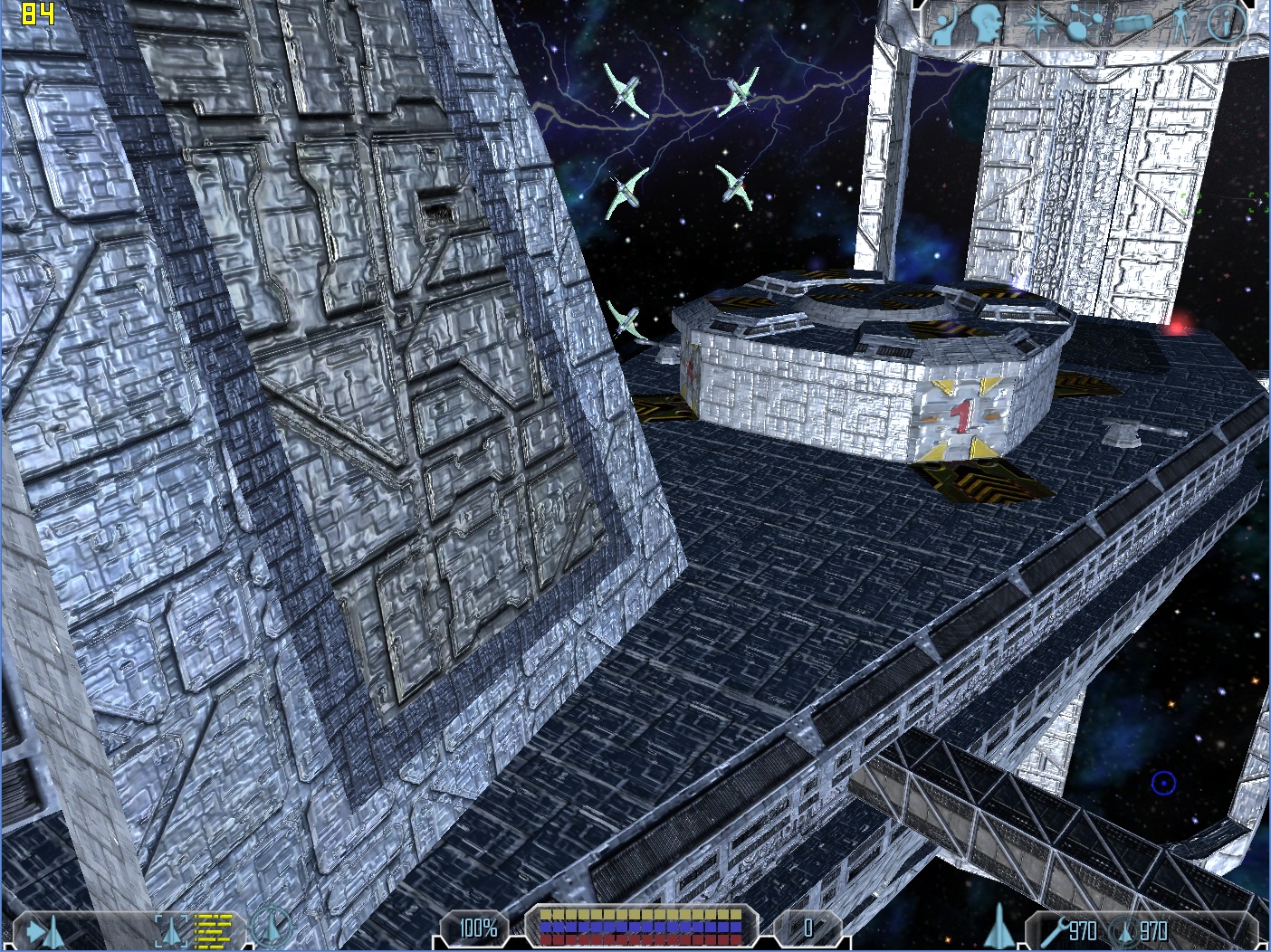
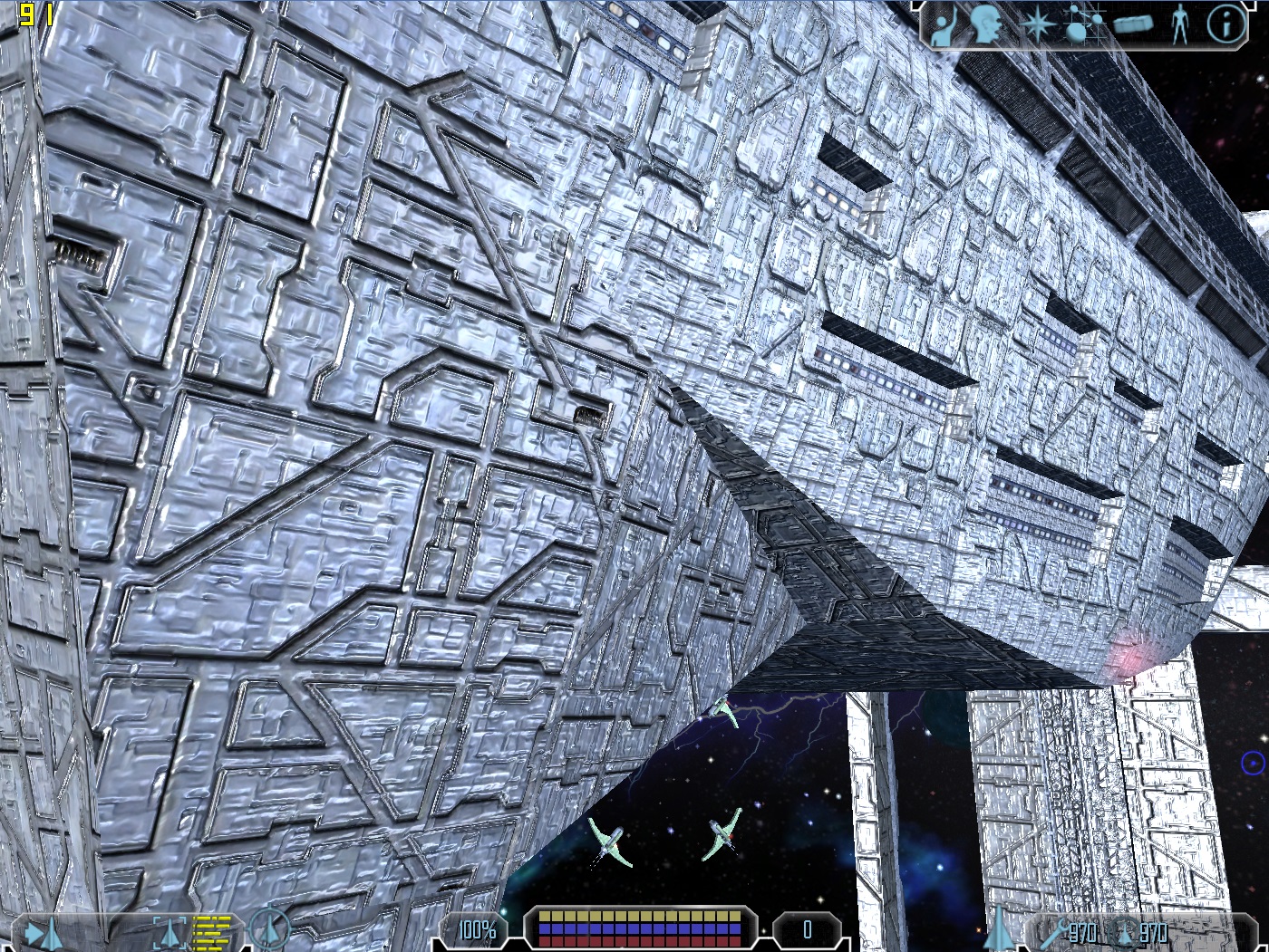
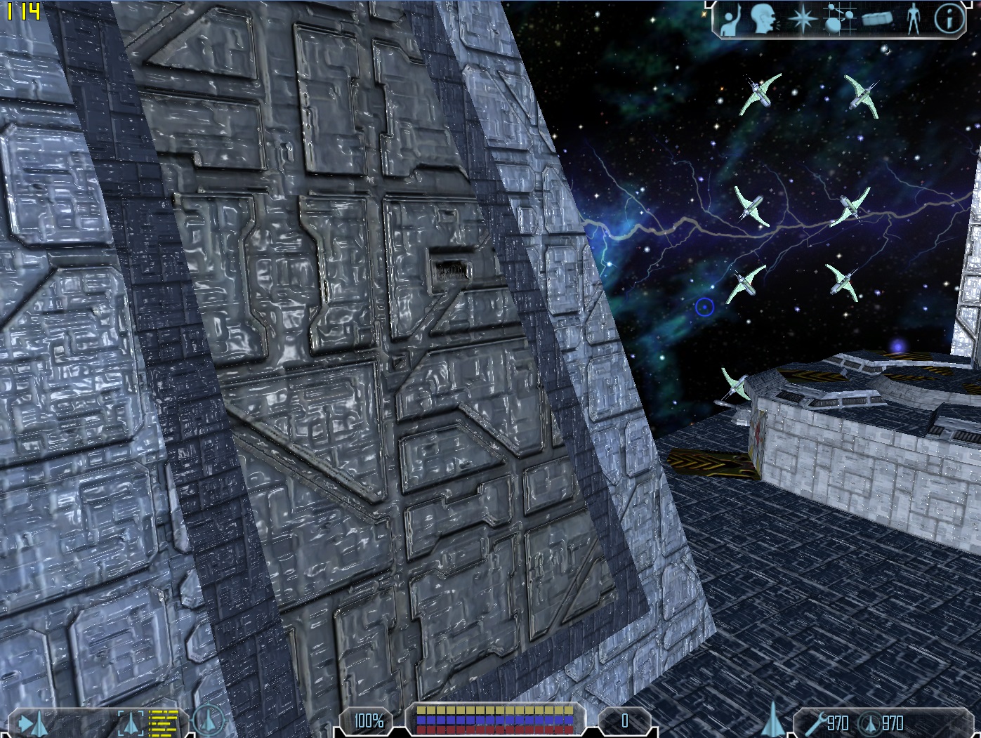
Also the material settings matter a lot and maybe I will change the lighting model again. Here is an example how easily 2 values change the look:
I think it looks better than before, though.
-
Looks like plastic wrap from photoshop!
-
Timmy51m wrote:
Looks like plastic wrap from photoshop!Thats the only trouble i think
-
-
guess metal should look like metal, unless its more an alien raw material. i would remove those hightmaps. Bases and ship hulls looking like “Streuselkuchen” dont really look nice and i dont think menkind would ever produce something like this ;D
But so far the approach of something like this on your engine is good.
-
Hehe, that is a decision of the texture artist, not mine. I just choose vanilla textures as an example, because everybody knows them.
P.S.: It is not an engine, just a wrapper from d3d8 to OpenGL plus some changes. I plan to release it for everyone as soon as I think it is polished enough (which will take some time, since as always I have other projects in parallel + university stuff).
P.P.S.: I am not finished implementing rendering techniques. Parallax mapping etc was just the start

-
Yes, all is just perfect except this glossy blured look. Try to normalize only plates’ edges
-
Initially I was really looking forward to FW:TOW dx9 being released for vanilla just because of the normal mapping, but after having a tinker with a few vanilla models in their old demo I wasn’t so keen anymore, I think the textures are too small and don’t lend themselves to normal maps very well either. No doubt someone with a lot of time on their hands and some good skills can do better than I did, but would be a lot of effort so good luck to you!
I tried using models from X3 and spaceforce however, and the results were awesome, so as with FW:TOW itself, with the right material it’s all good

If anyone has actually managed to make any of the vanilla models look good with normal maps etc I’d love to see some pics.
-
Just applying any sort of normal mapping system simply won’t work, and making generated normals based upon low res textures will never look good. You would have to hand make normals for the vanilla textures, or make high res versions of the vanilla textures and generate normals for those. However, at that point, you may as well hand make normals for those high res textures anyhow.
-
Yeah, I was going to write smth. like Sizer said. Usually a texture artist would create them for you. I still hope there is a way do generate good looking ones per algorithm, though
 (and yes I have been experimenting with it for a long time).
The previous normalmaps were generated based on an edge detection algorithm. If I don’t do that the look is quite different. I also scaled down the impact of the heightmap a little and changed the specular exponent.
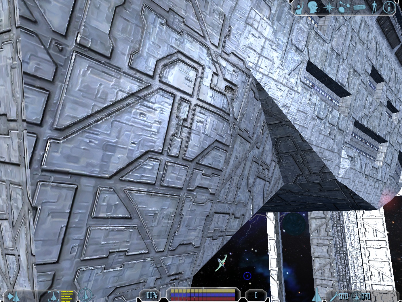
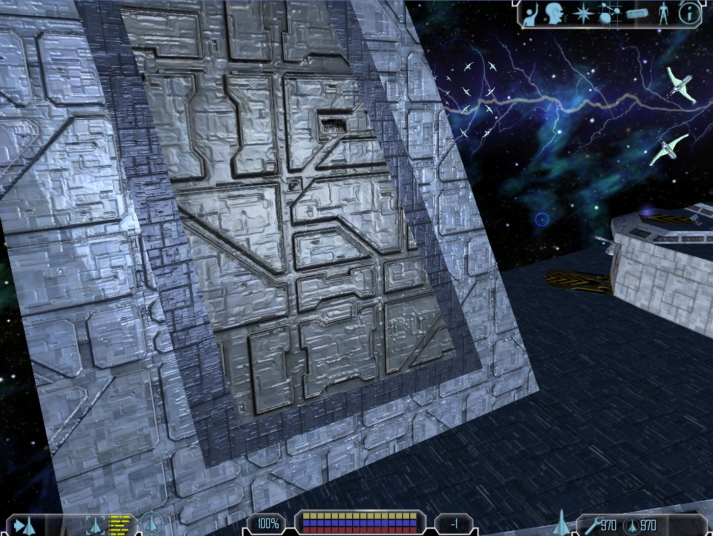
But I don’t plan to experiment with the values all day
 At least I think it doesn’t look that much like plastic (but that is rather subjective).
The weird egde in the last image on the left is a problem with the model conversion. I know what it is and how to change that, so don’t wonder.
-
You should check out Limit Theory. The guy’s managed to create some fairly nice procedural hull textures, and it’s only WIP.
-
I wonder what the base textures used in the shattered worlds mod would look like with normal mapping, always preferred them anyway.
-
On something like this, with the vanilla or vanilla style textures, the major paneling, the big shapes, should be on the normal map. The smaller plate details, the generic repeating ones, should be done via very VERY faint appearance on the normal map, and plate-style specularity. What I mean by that, is that on the specular map, every plate should have a hard edge and varied specularity, similar to the plating in this image -
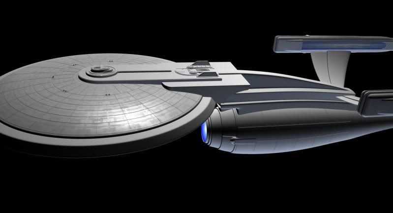
By heavily varying the speculartiy between highly reflective and matte, you can create additional depth information without overlapping normals, which look really bad, as demonstrated by the earlier screenshots.
-
@Alucard: Nice offer! I think I will come back to it as soon as I am sure what exactly I need (for now I am testing that out).
I added self shadowing of the textures (approximative), made proper heightmaps (was just a quick conversion) and fixed a weird bug, which I need to investigate further, which led to wrong rendering of the parallax mapping in one axis.
Note: Only 3 textures have self shadowing yet.
I think it looks quite better, but maybe it is too much height

-
-
Thanks for the nice picture
 The feedback I got was quite helpfull, yes. Although some of the changes I had planned anyway (e.g. for self shadowing I needed proper heightmaps). But it helps a lot to get other peoples perception in perspective.
DirtyLittleGirl wrote:
Now you only need to carefully texture the station to make good edges between textures.
Well, that’s were my job ends
 I don’t plan to do everything ^^
 -
Well done on getting all this stuff working Schmack, no small feat it should be said!
-
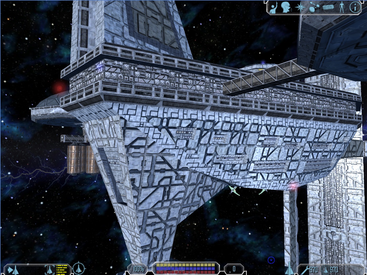
Well, I don’t want to misuse the thread so here are my last screens for now:
Again, it is a different self shadowing technique (I also made some more proper heightmaps)

I also really have to get back to university stuff. There is still a lot polishing to do, so no exciting screens anyway. Don’t expect a release soon, since I also have to test on other graphics chips.
For now I am quite happy with the result
 What do you guys think?
 -
I have replaced the two screens with ones where I have converted nearly all the textures. I think it helped the overall impression a bit more.
I’ve also added a third one where I noticed that it looks really nice.
The next step would be adding real shadows, but that’s a topic I better not talk about, since this means much more work as I have done for now. So no promises.
Hope you guys like it so far, as always I appreciate feedback so that I can get an impression what people like and what not. And I should really be doing something for university, really!

