New Renderer (OpenGL 3.3)
-
Parallax mapping!
 Great Stuff!
30 FPS : Ow OK! I don’t know why I didn’t think about that.
As FriendlyFire said it could be better to add a simple borderless windowed mode. Is it possible to force Freelancer to uniquely display this mode?
Thanks for the explanations!

-

Thank you adoxa! I always don’t know how you do to find the hex code of each modification. That’s stunning how fast you find them.
-
Sorry for the double post but I was searching for a LG monitor and I have found a 21:9 display.
Is there a possibility to implement 21:9 aspect ratio support to FL?
I don’t know if I will buy a 21:9 monitor or a new monitor but it could be an interesting and fun experience to play FL with this aspect ratio. ^_^
-
You can do it yourself with some work on HUDShift’s config file. Adoxa’s plugin handles aspect ratio issues aside from that.
-
Thanks adoxa for the offsets. Since I create the window myself I don’t even need them (at least I think so). Of course that does not apply to regular FL without the wrapper. Maybe one should add those to the “Limit Breaking 101” site?
In the meantime here is a screenshot from my latest version:
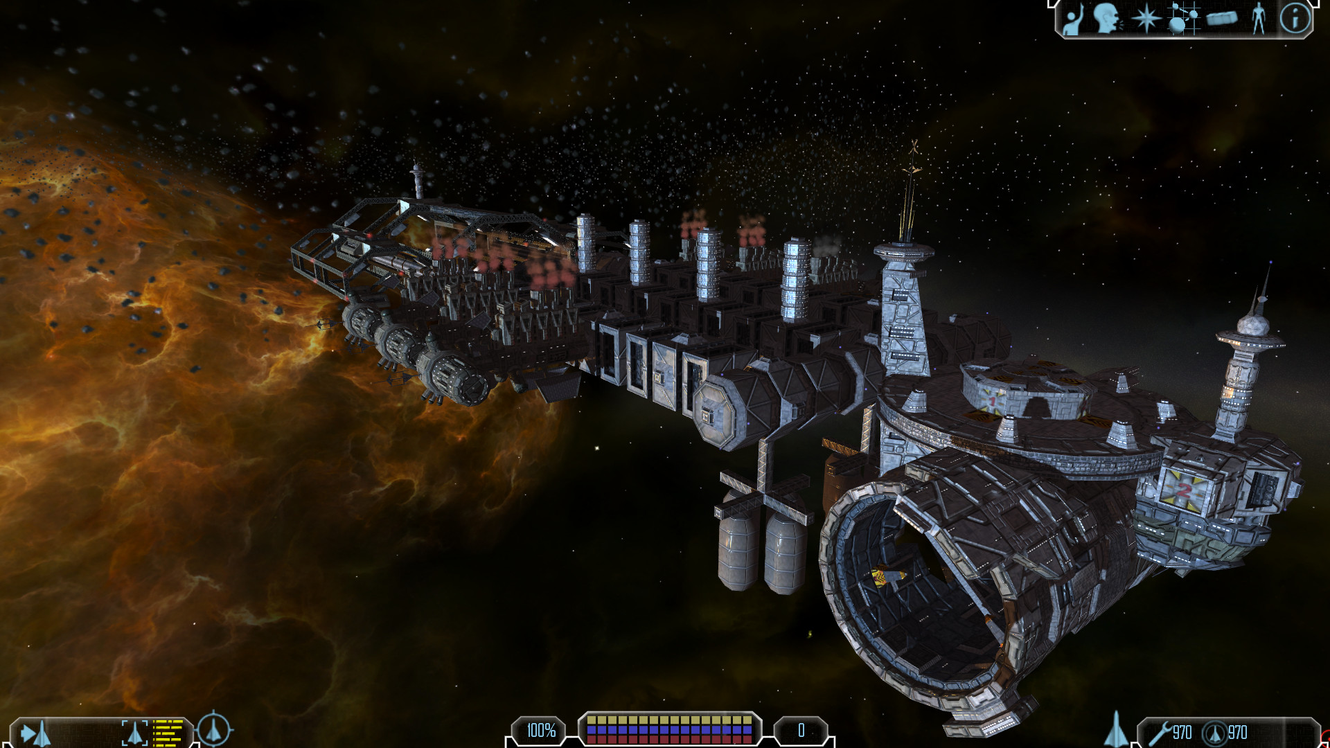
I just thought it looked nice. Might be a nice desktop background or so. -
@Freestalker: I had an email at the start of the year that JFLP (which includes HUD Shift) “Really made it easy to get the game to run at 21:9 resolution ratio.”
@Schmack: Have you considered the (equivalent of) FL Hack’s “Clean” option? That removes the HUD (and/or mouse) altogether, making it look even nicer.
-
Good idea!
Here is it without the HUD:
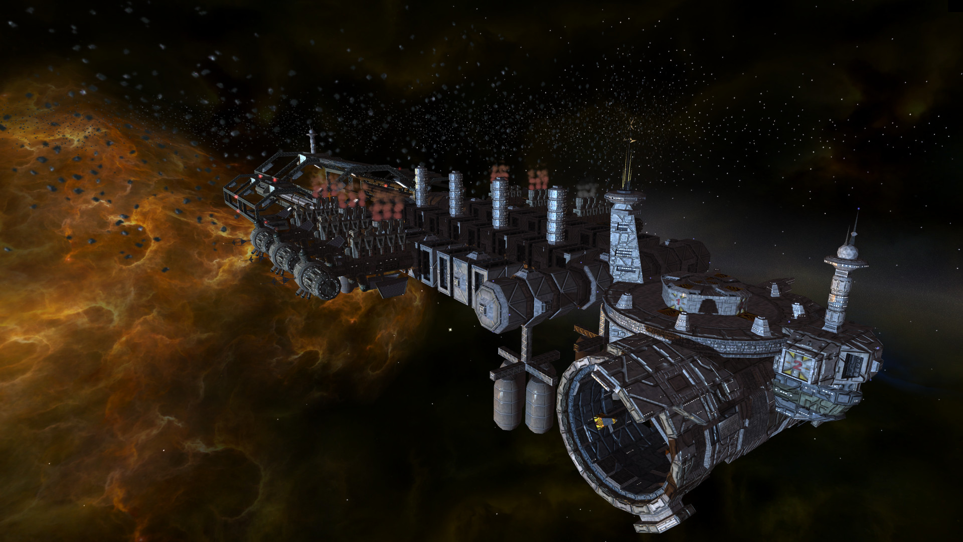
And, since besides nicer shadows not much is going to change visually (I have ideas, but better no promises), here is a version without the wrapper for an early before / after comparison:
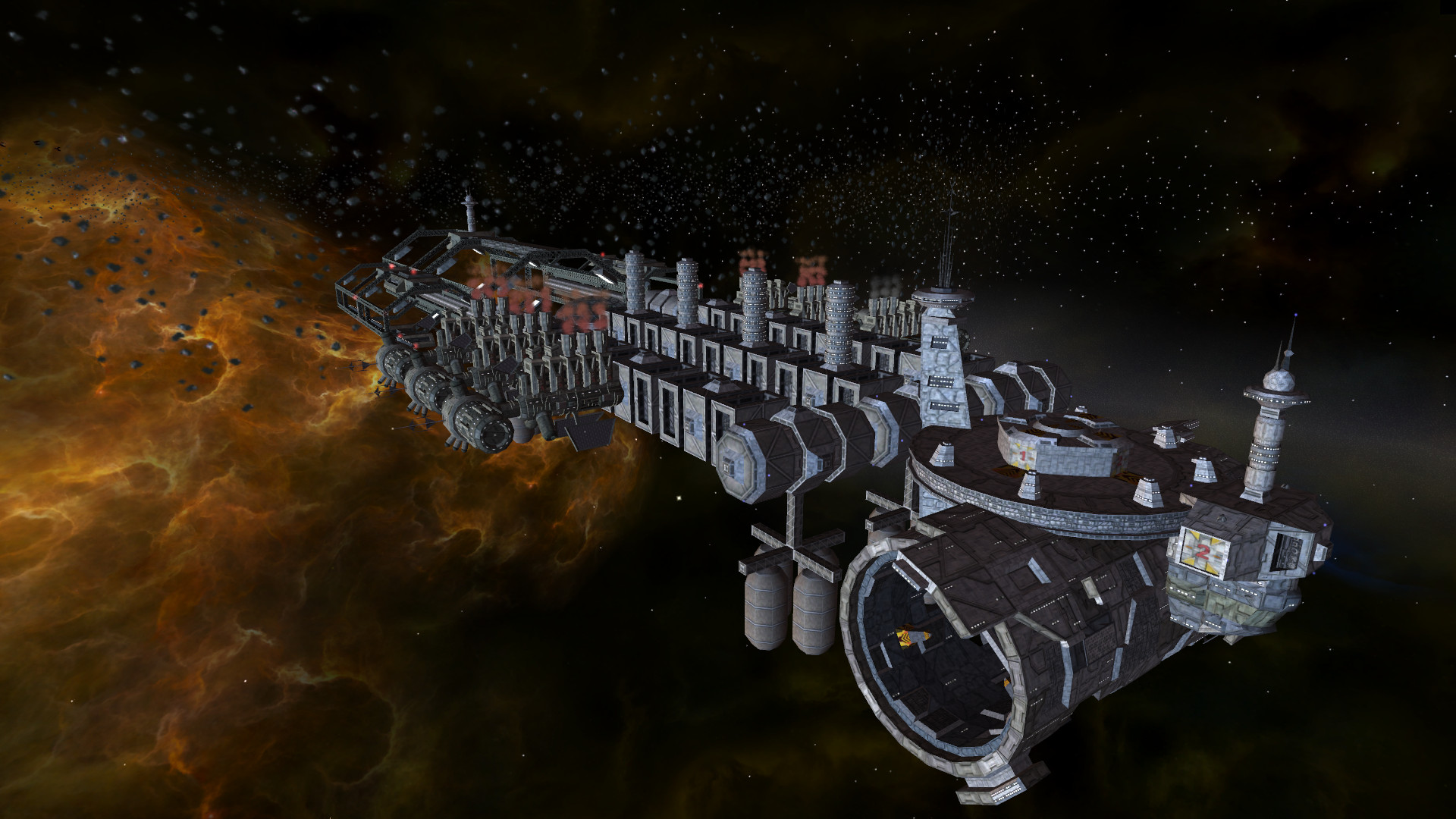
-
Looks oiled btw
-
I am not sure I follow. Oiled as in covered in oil?
-
Especially the storage tanks, like they’re coated with alien slime or some sh-it
 They look more plastic than metal, but that’s because the same levels get applied to every object I’d imagine, just like unreal engine 3 always has glossy everything.
I think it’s really great that you all continue to push this game well past its limitations, you’re a determined bunch and I hope the rewards are worth your efforts. I keep visiting just to see what crazy thing will be made possible next.
I think FF said a few years ago that without a complete retexture the dx9 wrapper wouldn’t make much difference to vanilla, beginning to see a lot of sense in that statement now. It’s the same as freespace 2 open, the models and textures are just so old and basic that normal maps don’t really do them any favours.
It’s hard to tell just looking at screen grabs I guess, do you think it’s a real improvement when you’re playing Schmack? Does your mod have plenty of custom models with better textures?
-
Yeah, they’re definitely referring to the specular highlights being too diffuse. I suppose you’re generating that on the fly or using just a fixed value for the spec power.
It wouldn’t be too hard to generate basic spec maps from the textures themselves, at least manually.
-
I think it looks better when you see it in movement, yes. More like a new game.
There is no material system, yet. The shader supports it, but it has the same value for every material. Also I am not sure whether I keep the current lighting model or choose a different one.
I plan to write a material editor with a preview. You will be able to set for every texture metalness, smoothness and specular intensity (that is for the currently used lighting model). So it can look like plastic, metal or in between. Also if this is not enough I can add every map you wish (specular maps etc), this is easy. But I don’t want to use a model no one is able to set the parameters for, because you need to measure them or they are too many.
In case I am able to render the whole scene to a cubemap or at least the starspheres, I could use image based lighting to get good metal reflections. But for now I am not able to do that. I will get to it when the rest is working.
My hope is, that with the possibility of better models / textures people will make those. Now it does not make much sense, but with the wrapper this changes. It is more like the chicken-and-egg problem.
Thanks for the good feedback, this is really helping me a lot!
-
I noticed one shader had old settings. Textures with only normal maps were not so smooth and reflected with a larger radius (that did not apply to the tanks, but e.g. to those towers with windows). You can see the effect for all materials in the second pair of screenshots below.
Here are a few examples of the settings:
Same settings, full specular intensity:
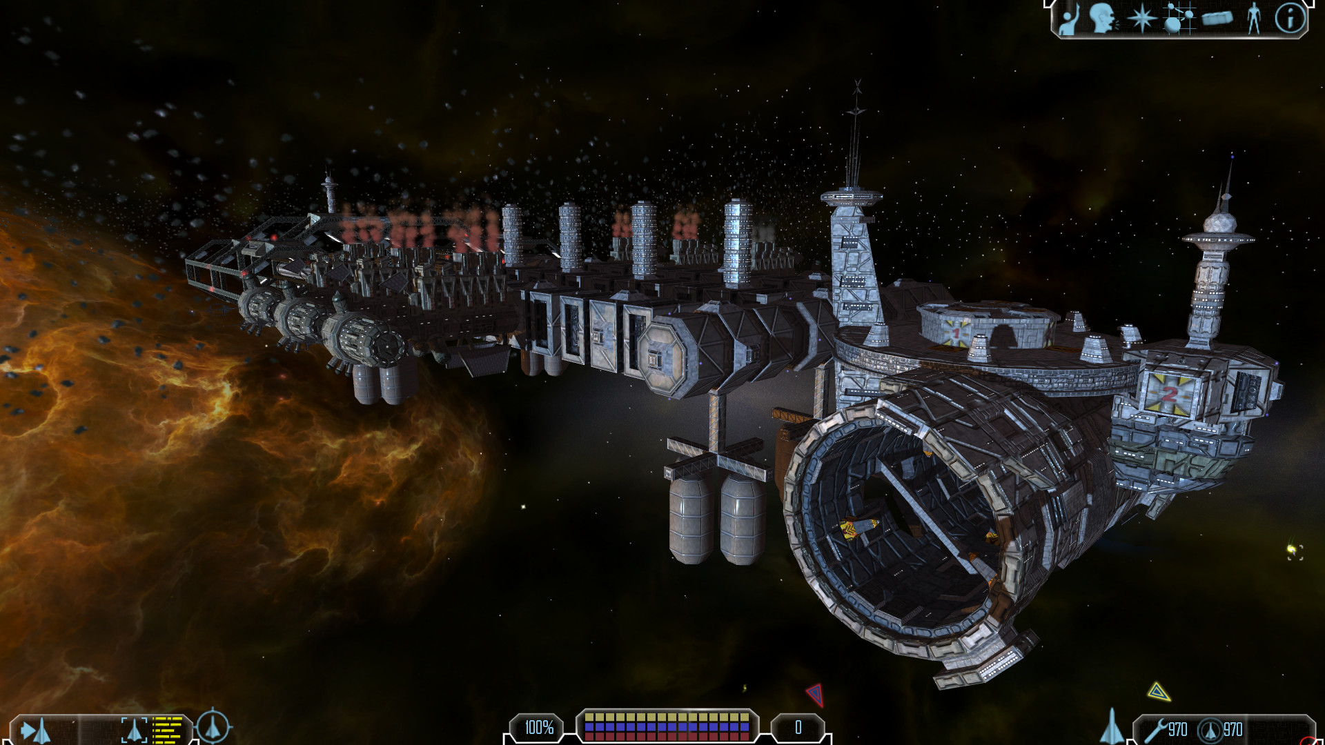
Same settings, half specular intensity:
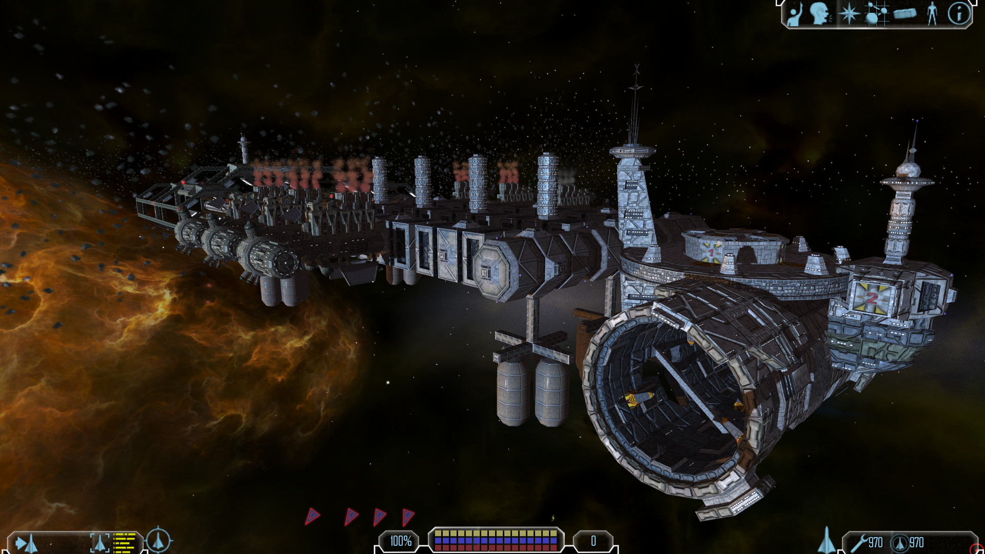
Less smoothness, full specular intensity:
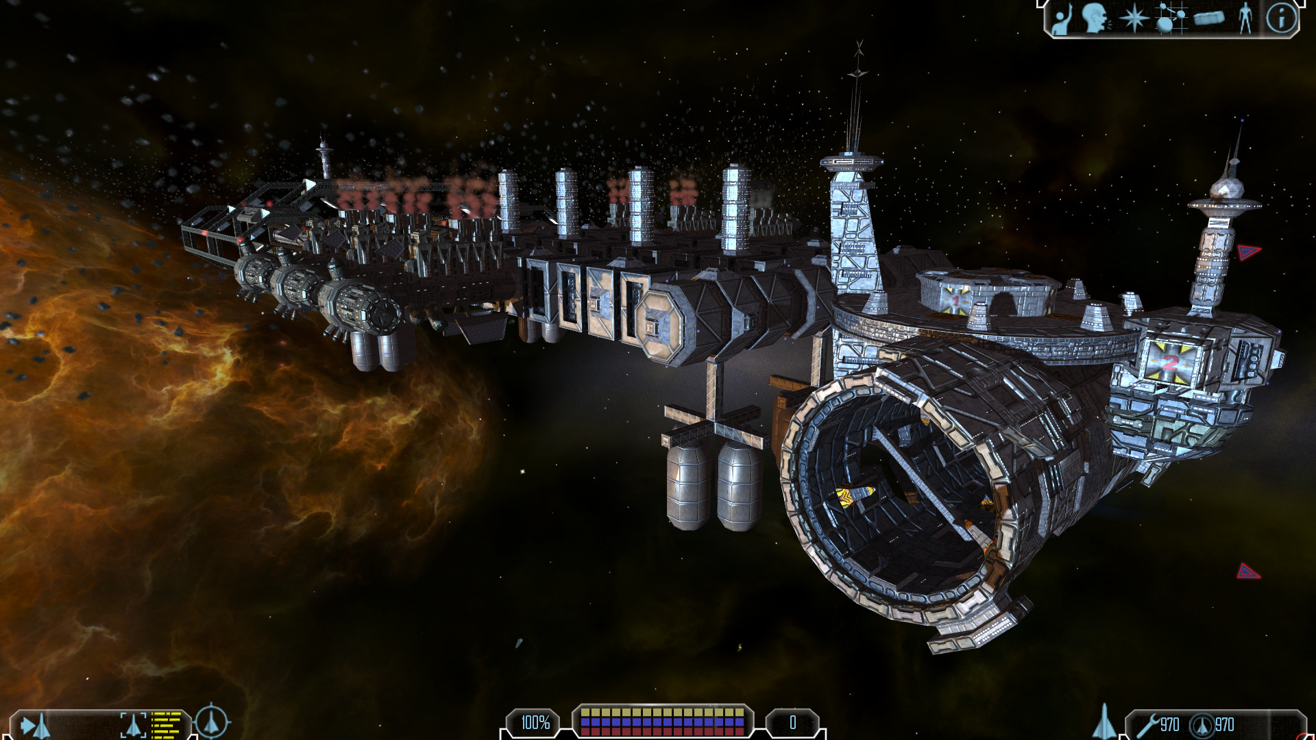
Less smoothness, half specular intensity:
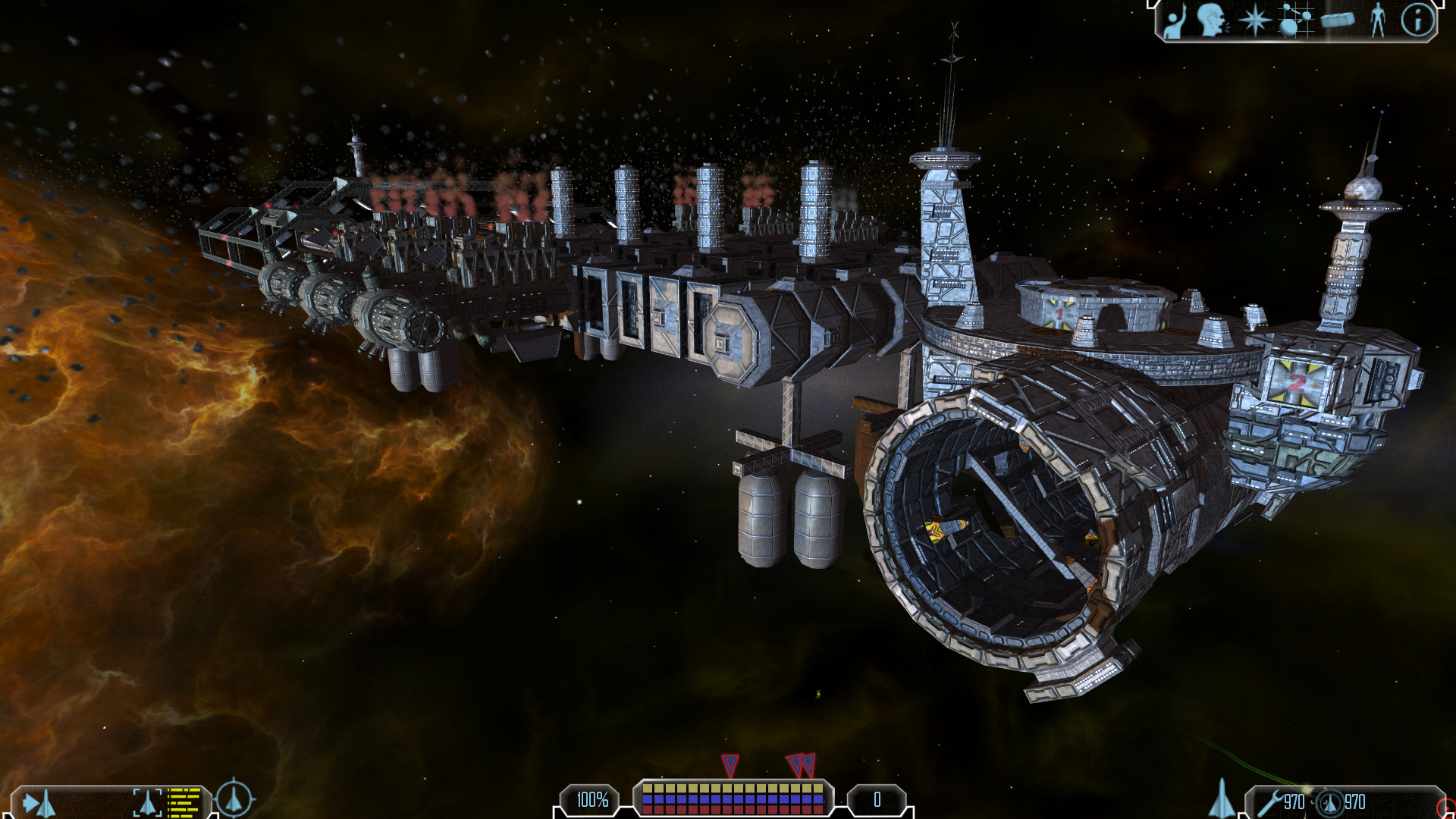
Update: Sorry, found an error in the lighting equation
 Images have changed.
 -
Yes. Looks like covered in oil. I dont know how it is bad ot good. Gameplay video is needed

-
It’s as sizer says.
That colour, the goldy stuff is bleeding like crazy throughout the scene.
-
I think that is because the reflective colour was wrongly calculated. Fixed it in the screens above. Please reevaluate. Also keep in mind that there are two light sources (one orange). Also there is a glitch at the storage tank which has to do with the tbn values stored in the model and will be fixed.
I can make another video, but for that I would use the settings you prefer. I also would like to be sure there are no errors left before I do one, since weird looking effects might be mistakes I made and did not yet find

-
Alright, I have checked the equations again and now they seem to be correct.
Here is a video with rather smooth settings and a little bit tuned down specular intensity:
LinkSince as mentioned there is no material system yet, every texture has the same setting. Also I don’t know whether I will keep this lighting model or choose another or even make it selectable per texture etc.
Edit:
Here is one with even less specular intensity: LinkBut I think it is better when I do more research before posting endless screenshots and videos. At least I think I do understand the problem now. Maybe it also is a matter of taste.
-
Looks okay in that last video, fix those tanks and you’re in better shape there I think. Does look far better in video than screenshots so well done.
It would be easier to form a proper opinion if you didn’t have different coloured light sources, something that never really made any sense to me in freelancer if I’m honest, but each to their own as it’s purely an artistic choice. If it were made per system, gas cloud, or purely dynamic effects like gas jets, station lights, laser beams etc I’d get it, but it doesn’t work well for my eyes when adjacent surfaces of the same station are lit in sharply contrasting colours.
-
oil is a good way to prevent oxidation (not that there is much oxigen in space… im just trying to find a good explanation)
also keep in mind that metal can have very different looks depending on its composition