3D Model Showroom
-
Gibbon wrote:
This will be an ELITE ship pack only. Models i have so far are theseAdder
Anaconda
Cobra Mk. I
Cobra Mk.III
Coriolis Station
Fer de Lance
Krait
Moray Starboat
Python
Sidewinder
Thargoid Mothership + tharglets
Viper
Viper InterceptorI’m still missing a bunch and hopefully these will be supplied to me for conversion…
Asp Explorer, Constrictor, Gecko, Mamba, Transporter, Boa, Worm and Shuttle is missing but anyway good luck with this project

-
Not bad, Gisteron, it even looks better with the spikes folded than the original one.
-
StarTrader wrote:
Timmy - shame on you - change your monicker to Timmy34M - thought it was your age and gave you too much cred - no longer will I take your comments literally.

About time you nutter. I’ve been telling you all not to take much of what I say too seriously for a long time now. First PC I bought for myself was an Alienware Area51m, first of three before I started to build my own, as such, it spawned Timmy51m.
-
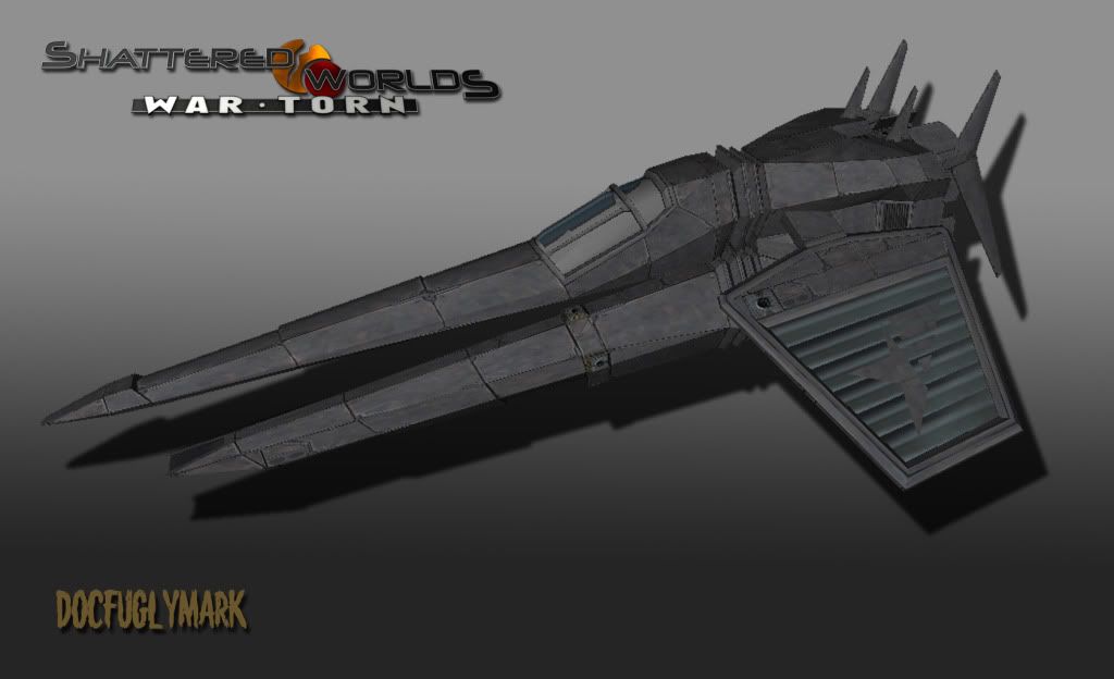
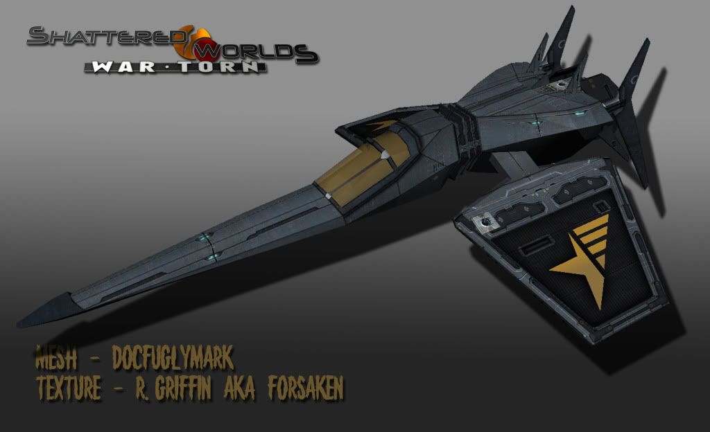
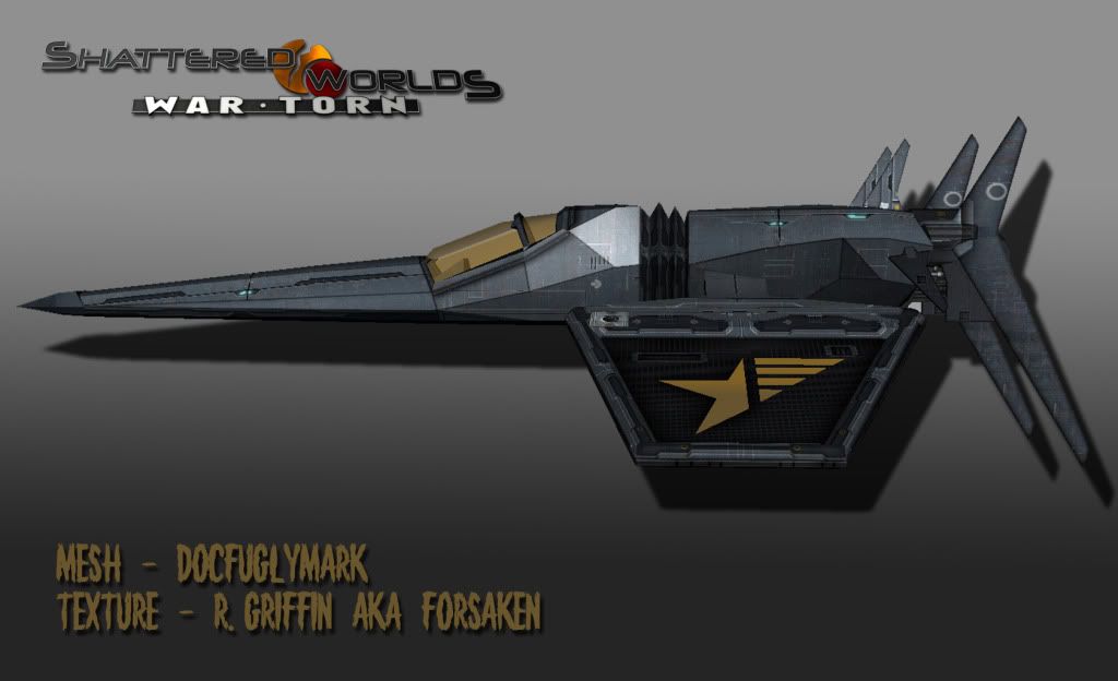
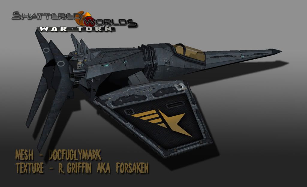
No clue where he got the mesh inspiration. We were wanting to break away from the vanilla precident on all of the house ships. After years of seeing Liberty (bird like models), Bretonian (fish like models), and whatnot… we wanted to do a change up and make ships that actually look high tech.
Regarding the texture, I knew exactly what I wanted to do with the wings. However, I wanted to do a texture similar to his “Vengeance” ship line but make the armor consist of plates similar to his original texture. Overall, I’m happy with it, I just need to get faster at this… it took over 20hrs to re-UV map and create the textures for it.
Off topic: Here is a picture of a “heavier” ship in this replacement line whose texture has not been redone (and is currently utilizing the liberty mat).

-
i didn’t even use any UV maps. too much time waste and with the program i use you can apply textures as procedural though rotate them, scale and strech them and translate them to any position you want.
if i want e.g. multiple rectangular shapes (on the model) to have the same symbol, i duplicate the material and later on in milkshape point to one and the same and the game does the rest just fine.
its cool that the ingame materials only define how they look like, not where on the model they should apply in which way.
however as a note i do all mat files manually… nonetheless its faster than UV mapping with the poor skills i have^^ -
We were wanting to break away from the vanilla precident on all of the house ships. After years of seeing Liberty (bird like models), Bretonian (fish like models), and whatnot… we wanted to do a change up and make ships that actually look high tech.
Agree. Vanilla FL is a nice thing, but it is old. After all the years the majority of the vanilla-based mods have the same ships with same design elements, but what looked so cool back in '03, looks odd nowadays. IMHO today ships like the ones in EVE or BL are much more modern and I strongly agree with you Forsaken, that they needs to be made more cutting edge and sophisticated.
BTW great ship. It is a scout or interceptor?
-
The vanilla models suck. They make me think of how people portrayed “the future” in the 80s. Back to the Future-style.
I love that new model Forsaken, and that’s some lavish paint job

Reminds me of Wipeout ships, which are epic.
-
FriendlyFire wrote:
The vanilla models suck. They make me think of how people portrayed “the future” in the 80s.Agreed, but the same will say the ppl in 20 years when they see the actual portray of “the future” today.
-
Yes, but (and people will kill me for this :D) compare the ships in EVE online and Freelancer…both games are from 2003. Both have 4 major superpowers, both have Terran-based ancestor states, both set in distant future, and still which of the games have more ship like vessels? Sure we all like the FL ships…this is after all one of the reasons why we play teh game…but if I had a to choose a fighter to go in a battle, then I choose the ones from Freespace II or EVE…I will feel unsafe in FL ships

-
Yeh, they look fragile. But hey! they were better in beta

-
in a way you are right, FL designs are not realistic or strong. but somehow i like them that way. its sorta classic. i don’t say there is no better way to design vanilla. but keeping the shapes and making the meshes a bit more like modern elite military vessels are, with a lill bit scifi and you can show them again. the shapes themselves imo are great, but not interpreted good enough by the very modeler. sure some intermediate concept art looked just what i am talking about.
-
Lets be honest, the only thing that matters to us is how aesthetically pleasing on the eye ships are, and in that respect we’re all looking for something different from one another.
I would imagine in reality that spaceships might as well be like a brick or a ball for all the difference wings and aerodynamics would make up there. Only ship I’ve ever seen in a movie or anything that I thought made sense was the bubble fighter in lost in space, great view of things in that bubble and why wouldn’t you build a fighter with a 360 view if you could. You might attach the cockpit to a motorized gyroscopic frame of sorts to spin the ship on any desired axis, rather than turn the ship like an aircraft you would just point the thrusters in what ever direction you wish and have a 360 field of fire as a result. Be almost as though you were sat in a motorized turret that you could also fly. Imagine how fit you might have to be to withstand all that spinning and changing direction, combat would be insane. -
Talking about realism, the this:


