What do you think?
-
Aye, looks sweet fair play.
-
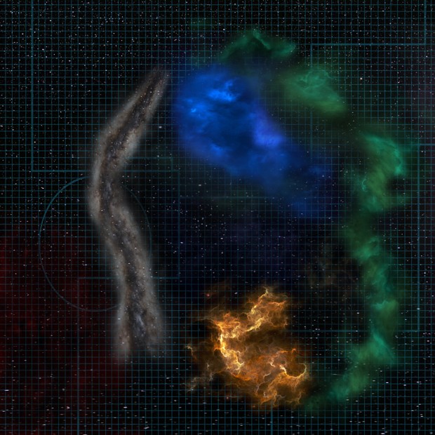
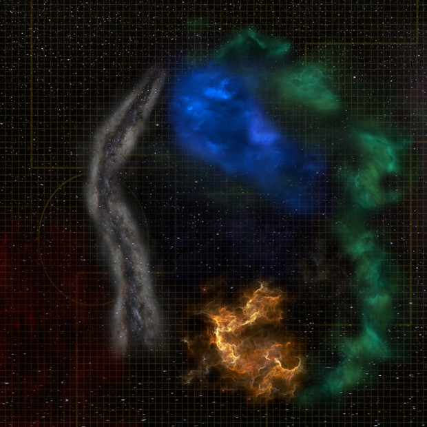
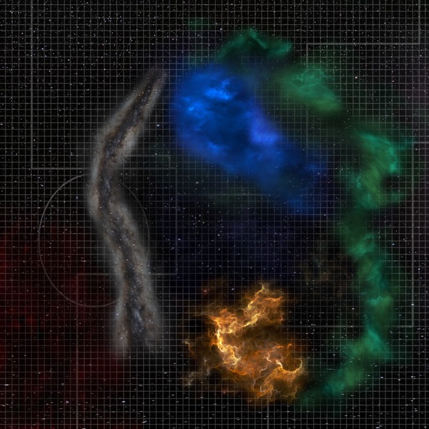
The first nav map is the best in my opinion, because the lines aren’t that strong/bright. I like their discreetness.
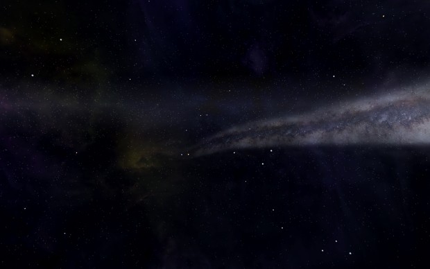
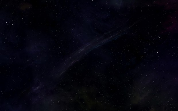
I think the edges of the Barrier Nebulae (the white long one) are very hard. Maybe you can soften them a bit.
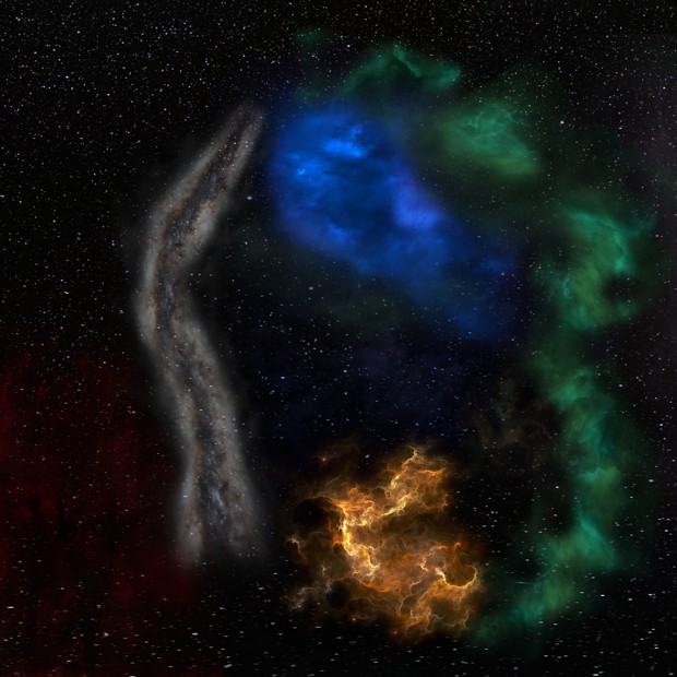
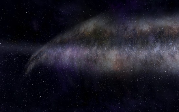
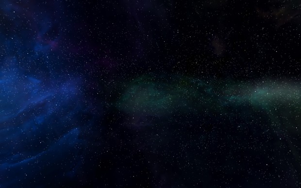
It would be also good to add some red nebulae where Bretonia is, because they have a very red tone around their systems.This is how I interpreted the red nebulae around Bretonia:

(These hard edges aren’t that visible on a black background like you have it in the nav map)
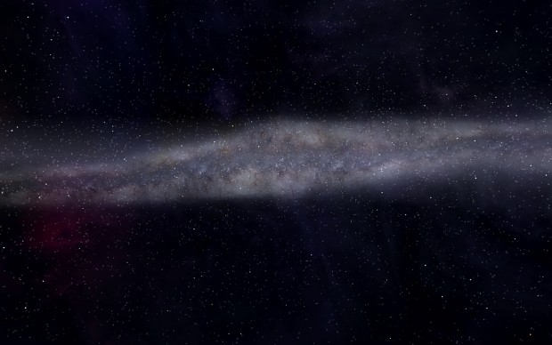
And this is how I tried to make a decent way of a star-background for the nav map:

-
Now it looks perfect.
-
me want

-
-
Looks good honest, most important thing is that you’re happy with it.
-
Stunningly good, can’t wait to see the finished product!
-
Woo! Cannot wait to see these bad boys in game!!
-
just can repeat what is already said a few times
:beatiful and stunning work
-
Ohhh!…. Gorgeous and astonishingly timeless!
-
Took a long time, but finally i done with it.
http://www.gamefront.com/files/21595997/Freelancer+HD+Starsphere+pack.rar