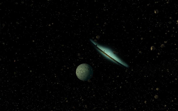
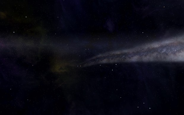
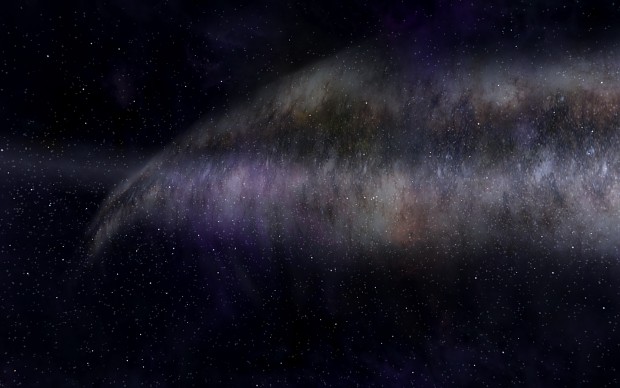
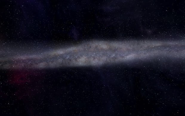
What do you think?
-
Nice work here man.
-
I know our team is really looking forward to getting a closer look at these. I’d love to use them for the Freeworlds: Tides of War mod

-
rik_starkiller wrote:
@ Timmy, I think I’ll be able to produce nebulae that fit this. If they look like blocks, try lowering the brightness of the colour in the [Fog] section, that way they should blend in a little better.
RikI’m saying the when I try to make my own I can actually see the texture tile, they look like paving slabs in space. Must need an alpha layer or something I think and I’m not sure how to go about that sort of thing.
-
I have some difficulties (not with the “project” ), so the release date perhaps will be delayed. I will try everything to finish in time, but i can’t promise anything… sorry guys

-
-
Aye, looks sweet fair play.
-
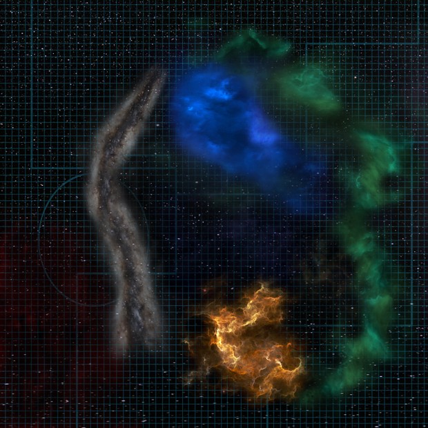
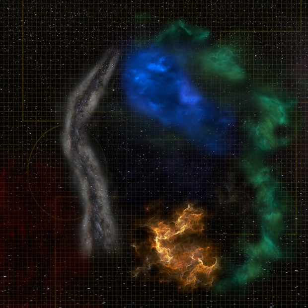
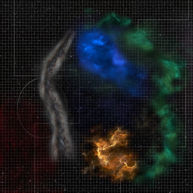
The first nav map is the best in my opinion, because the lines aren’t that strong/bright. I like their discreetness.
I think the edges of the Barrier Nebulae (the white long one) are very hard. Maybe you can soften them a bit.
It would be also good to add some red nebulae where Bretonia is, because they have a very red tone around their systems.This is how I interpreted the red nebulae around Bretonia:

(These hard edges aren’t that visible on a black background like you have it in the nav map)
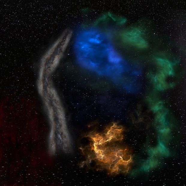
And this is how I tried to make a decent way of a star-background for the nav map:

-
You’re right, i corrected a few things, and changed the pictures of the new ones. If anyone have any thoughts, I like to read…
-
Now it looks perfect.
-
me want

-
These starspheres look amazing. Did you/are you going to upgrade these starspheres? Bw03, Bw05, Ew02, Ku06, Li05, Rh01_nebs, Rh06, St01, St02 and St03 (not St03b.) They aren’t used anywhere in Vanilla but a lot of mods use them for custom systems.
-
-
Looks good honest, most important thing is that you’re happy with it.
-
-
I love this, dammit, why i cannot make starsphere like this.
-
Stunningly good, can’t wait to see the finished product!
-
Woo! Cannot wait to see these bad boys in game!!
-
awesome
-
just can repeat what is already said a few times
 :
:beatiful and stunning work
-
Ohhh!…. Gorgeous and astonishingly timeless!
