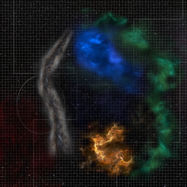
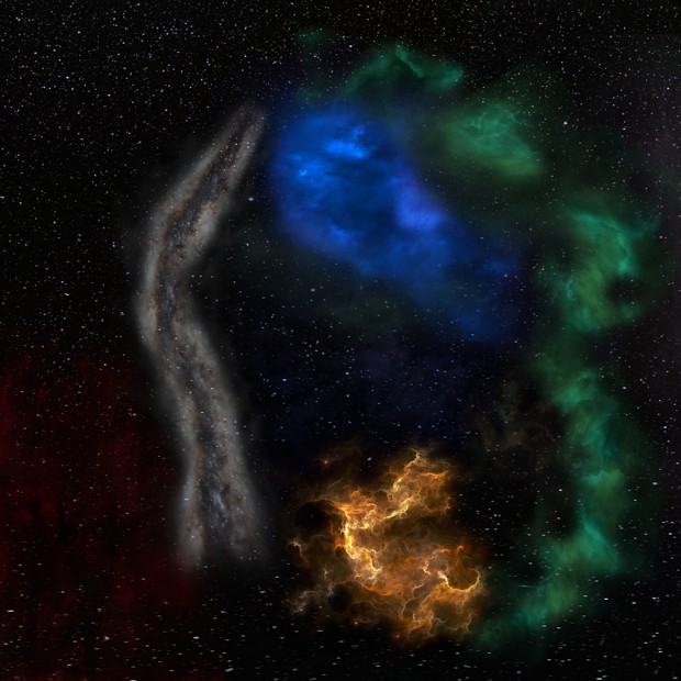
What do you think?
-
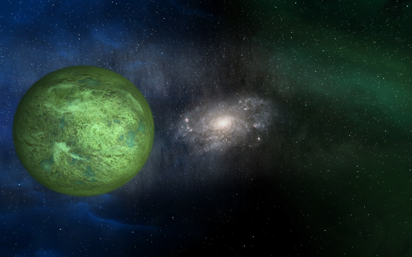
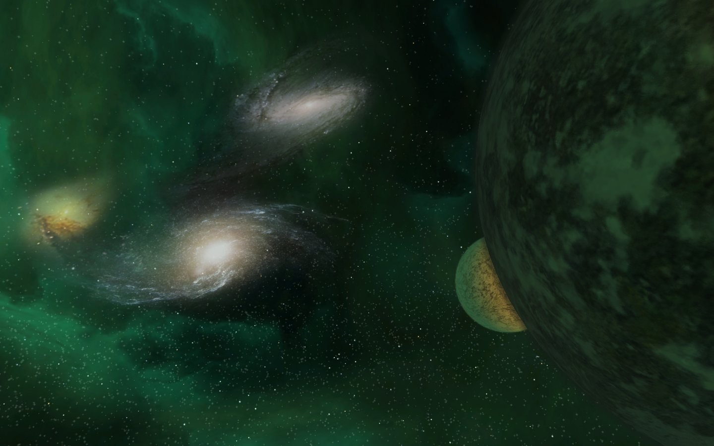
They do look fantastic! But i note you don’t show any of the nebulas in your screenshots. I tried going down a similar route to yourself but the nebulas looked bloody awful cos they just don’t blend in with that sort of background. Ended up using very similar textures to the originals, you can see bits of them in my Xlancer pics in the gallery.
Yours will be bloody awesome if you don’t use any nebulas though, or you can make better textures for the nebulas to compliment them. I tried but failed, looked like big square blocks in space for some reason, maybe alpha or something I guess.
Top work anyway!
-
Well, you could think over using the HD textures as a base to start your texture work with. Just a rand() idea, I am not going to dictate you how and what you should do and what not.
-
Hidamari wrote:
omg sex for my eyes.
@Hunor:
said that before, but thats looks impressive.
& u dont need to fusionate packs, cuz afaik the fl-hd pack and custom starspheres wont bite or override eachother.
so everyone can decide what he/she is using.anyway, im lookin forward to the release

-
@ Timmy, I think I’ll be able to produce nebulae that fit this. If they look like blocks, try lowering the brightness of the colour in the [Fog] section, that way they should blend in a little better.
Just incase anyone else doesn’t know what the hell I’m going on about, both [Fog] and [Exterior] are viewable from distance. [Exterior] is the core of the nebula and [Fog] is the surround.
For more info see here: http://the-starport.net/freelancer/forum/viewtopic.php?post_id=8260#forumpost8260
Hope this helps someone.
Oh and Hunor, I’m loving the latest productions!
Cheers,
Rik -
I know our team is really looking forward to getting a closer look at these. I’d love to use them for the Freeworlds: Tides of War mod

-
rik_starkiller wrote:
@ Timmy, I think I’ll be able to produce nebulae that fit this. If they look like blocks, try lowering the brightness of the colour in the [Fog] section, that way they should blend in a little better.
RikI’m saying the when I try to make my own I can actually see the texture tile, they look like paving slabs in space. Must need an alpha layer or something I think and I’m not sure how to go about that sort of thing.
-
Aye, looks sweet fair play.
-
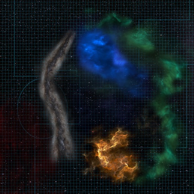
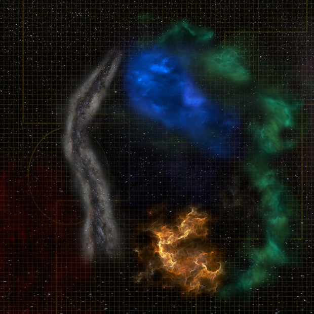
The first nav map is the best in my opinion, because the lines aren’t that strong/bright. I like their discreetness.
I think the edges of the Barrier Nebulae (the white long one) are very hard. Maybe you can soften them a bit.
It would be also good to add some red nebulae where Bretonia is, because they have a very red tone around their systems.This is how I interpreted the red nebulae around Bretonia:

(These hard edges aren’t that visible on a black background like you have it in the nav map)
And this is how I tried to make a decent way of a star-background for the nav map:

-
Now it looks perfect.
-
me want

-
-
Looks good honest, most important thing is that you’re happy with it.
